What are Sparklines?
Sparklines are miniature charts that are heavily simplified and typically fit into a line of text or a cell on a spreadsheet. Their first appearances date back to 18th century chivalric novels and the display of barometric signatures of the notorious 19th century Krakatoa eruption. Unlike classic charts, Sparklines are meant to be succinct and located right where they are discussed. Microsoft’s XLSX format has included these mini-charts for quite some time. With the major release of Collabora Office 22.05, Sparklines became available within the LibreOffice technology ecosystem. Shortly afterwards, they were also implemented in Collabora Online 22.05 and LibreOffice 7.4.
How to Insert Sparklines
To start using Sparklines, simply follow these steps:
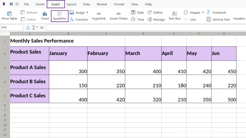
- Navigate to Insert > Sparklines:
In your spreadsheet, go to the Insert tab, then select Sparklines. - Customise the Sparkline:
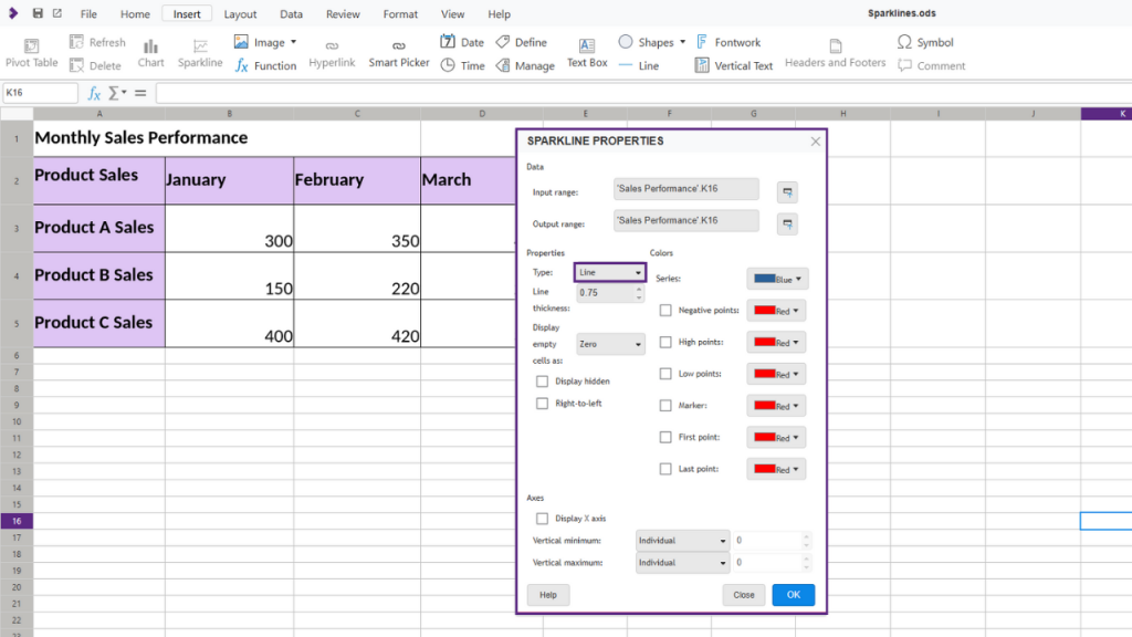
Choose your preferred sparkline type (Line, Column, or Stacked). You can adjust the color, line thickness, and options for handling hidden or empty cells. Collabora Online also allows you to highlight specific points—such as high or low points, first and last points, or negative points—using custom colours for better clarity.
Example: Track Product Sales with Sparklines
Let’s walk through adding sparklines to visualise the monthly sales trends for three different products.
Inserting a Line Sparkline for Product A:
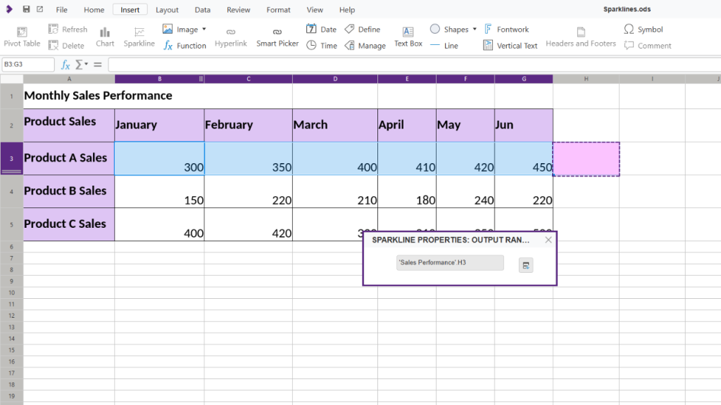
- Select the sales data for Product A.
- Go to Insert > Sparklines and choose Line.
- Choose a cell to display the sparkline; place it next to Product A’s data.
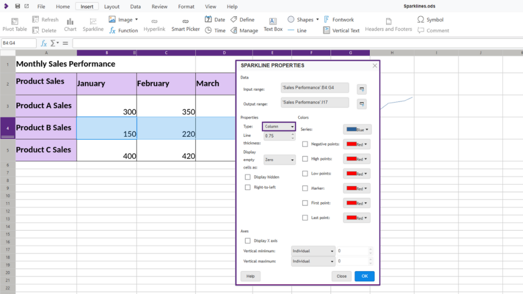
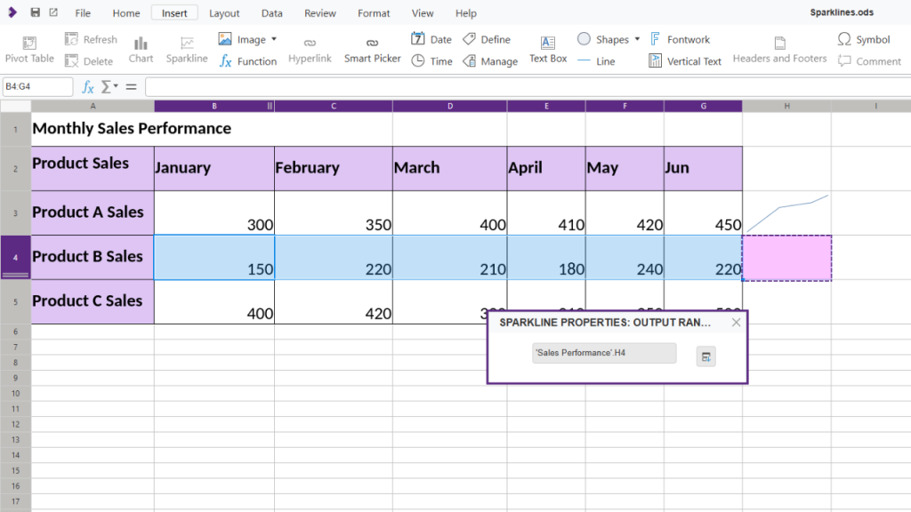
Inserting a Column Sparkline for Product B:
- Select Product B’s sales data.
- Go to Insert > Sparklines and pick Column.
- Place this sparkline in the column adjacent to Product B’s data, allowing you to compare month-over-month performance easily.
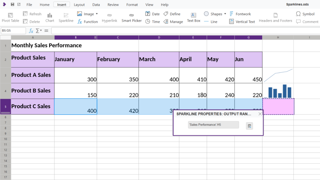
Inserting a Column Sparkline for Product C:
- Similarly, for Product C, select the sales data and go to Insert > Sparklines.
- Insert a Column Sparkline and place it in next to Product C’s data.
Grouping and Formatting Sparklines
To apply consistent formatting across all sparklines, you can group them:
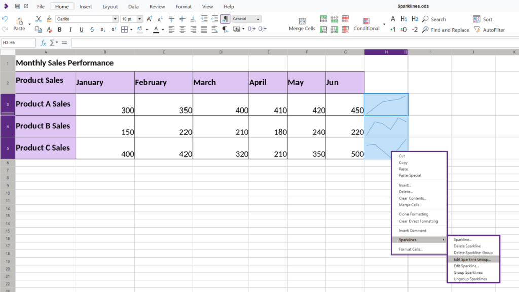
- Right-click on the sparklines and select Group Sparklines. Now, any formatting changes you make will apply to the entire group.
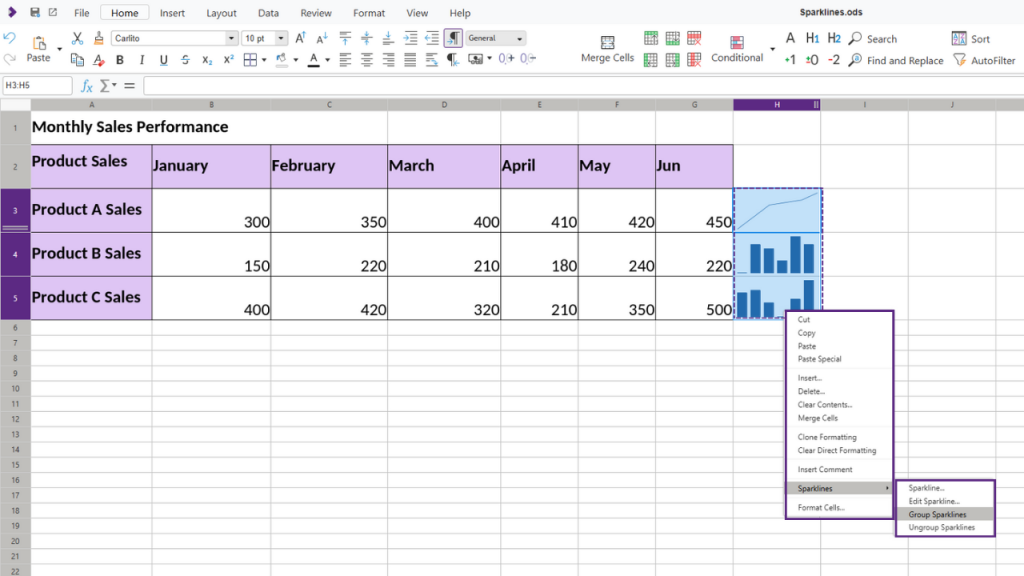
Grouping sparklines ensures consistency across your visual data, making it easier to compare different products or metrics side-by-side. Grouped sparklines inherit properties from the first sparkline in the group, making it easy to adjust all sparklines at once. You can right-click and select Edit Sparkline Group to further customise or modify settings for the entire group.
Customising Sparklines
You can further personalise your sparklines to emphasise key points:
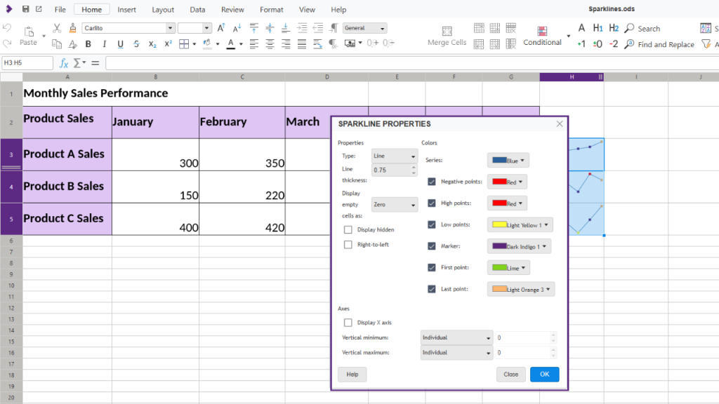
- Change colors and line thickness: Use unique colors to differentiate each sparkline, making trends clearer.
- Highlight key points: For example, select High Points and set them to red to mark peak values in your data. Similarly, you can mark low points, first/last points, or even negative points with distinct colours.
Adjusting the Sparkline Display
For additional clarity, you can:
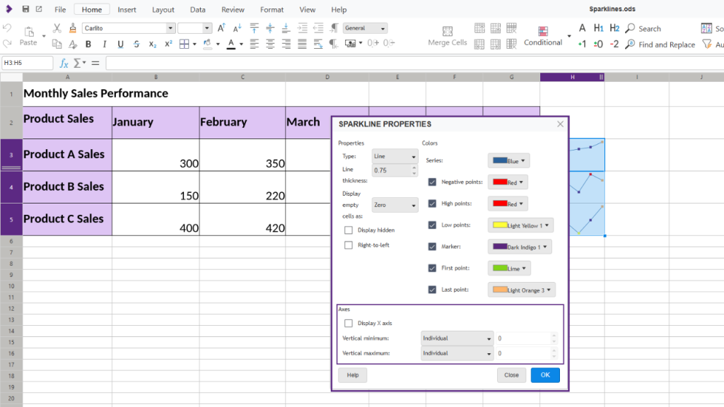
- Display the X-axis to enhance readability.
- Adjust the vertical min/max settings to control the sparkline scaling, allowing for a clearer comparison.
Conclusion
Sparklines in Collabora Online offer a quick, visual way to make data more insightful. Whether you’re monitoring sales, project timelines, or any other data, these mini-charts help you understand trends at a glance. Give it a try in your next spreadsheet!
Thank you for making this possible
This feature was made possible by funding from NGI and the European Union’s Horizon 2020 research and innovation programme under grant agreement No 871498. For more information on the technical background, see Tomaz Vajngerl’s blog.


