
1,000,000 Data Points for an Update?
TL;DR
In response to user feedback, we’ve made the Collabora Online interface more discoverable and learnable, with extra power on tap: context-aware menus, progressive disclosure, responsive toolbars, presenter controls, and clearer icons, so your team can move faster with less training.
How we did this
This refresh is about one thing: removing friction so more users can get more done.
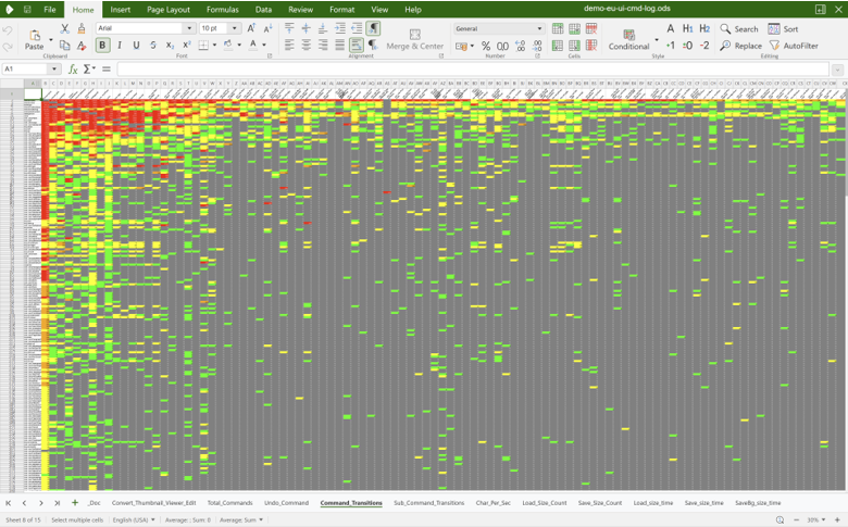
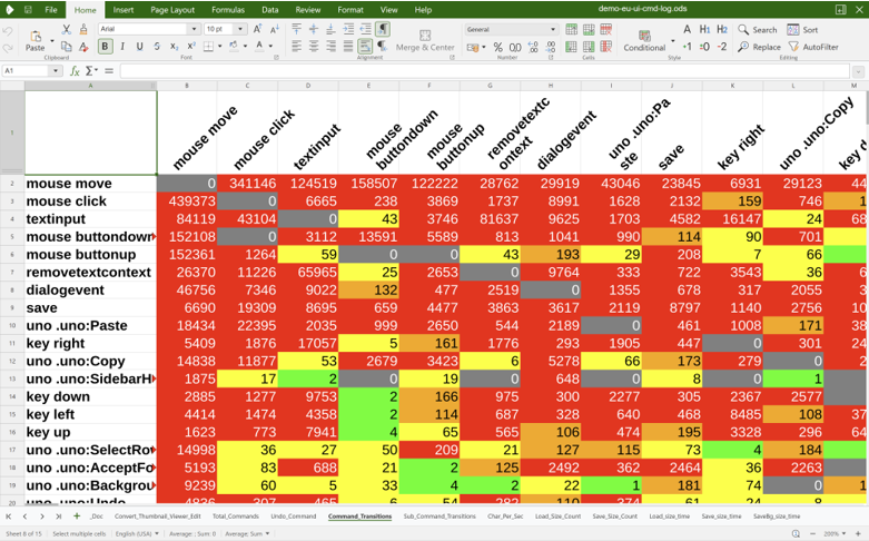
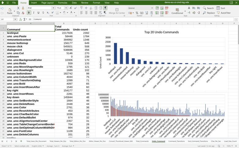
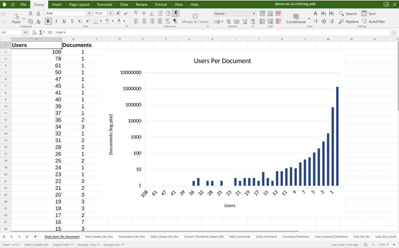
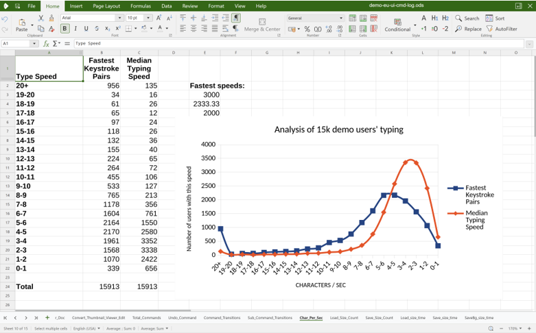
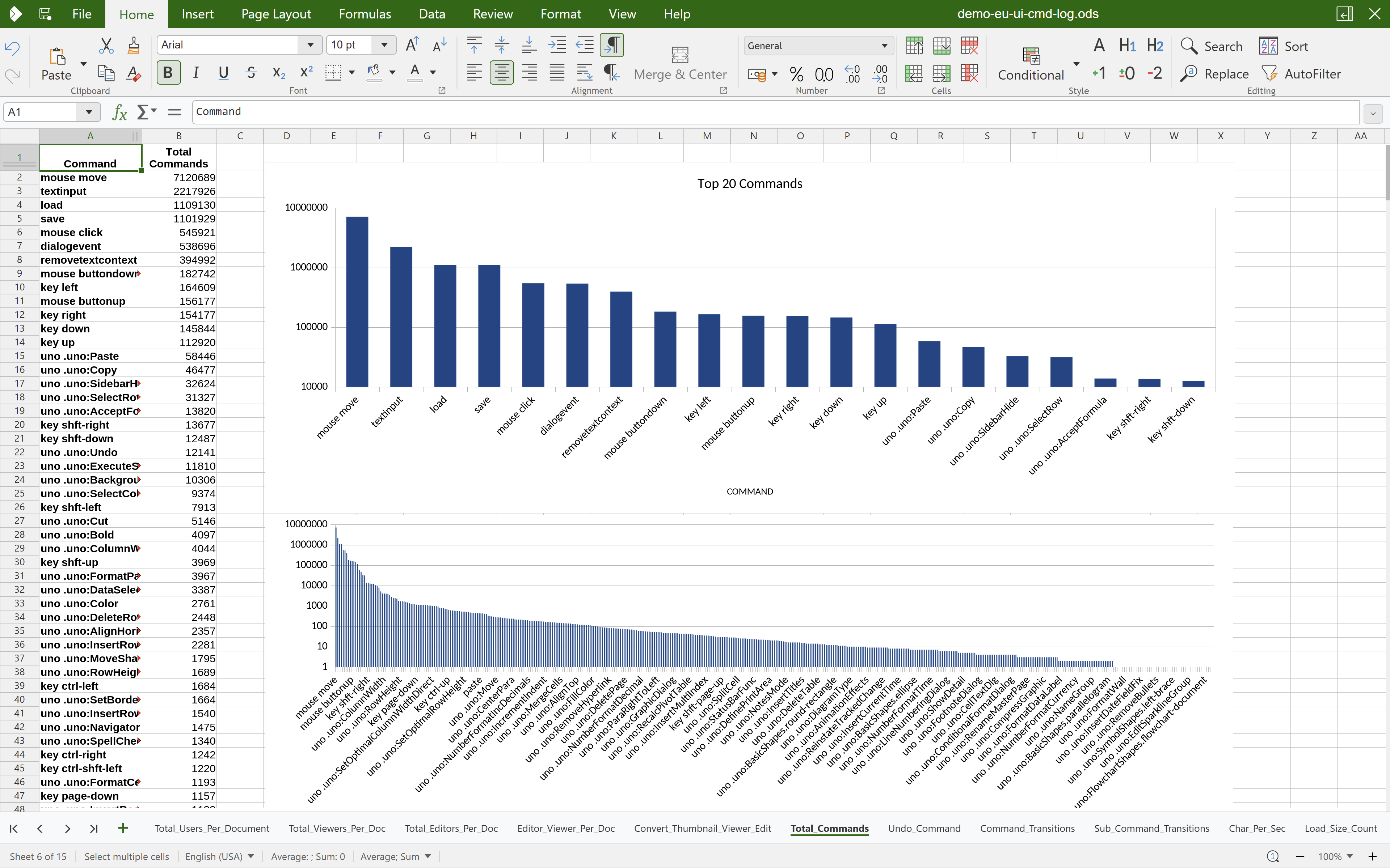
We didn’t guess. We listened and we measured. Over the past months we’ve gathered feedback from customers, partners and the community, watched real users work, and added light-touch UI event logging on internal systems to understand where people slow down, and provide us with a clearer understanding of how editors act inside a document. We then redesigned around those findings.
Some Analytic Takeaways
- People prefer controls in context, rather than hunting through tabs.
- Power users still need depth, but not all at once – hence progressive disclosure.
- Responsive grouping beats scrolling for narrow windows.
- Clear icons and shortcuts reduce hesitation and speed up repeat tasks.
- A unified Navigation sidebar (find/replace & outline) helps everyone.
Round 2: Highlights
Quick access to standard settings
It’s important that your document editor has advanced editing settings and granular controls, but sometimes you just want some simple default settings to choose from.
We’re adding standardised examples into our user interface to make the most frequently used settings quick to change, as well as providing simple graphics to make sure they can be understood at a glance.
Present with confidence: in‑slideshow controls
While presenting in Impress, you now have simple in‑slideshow buttons to go forward and back. This allows users to use a keyboard or mouse to navigate.
Another feature unique amongst office suites is the ability to toggle off all transitions on the fly without modifying your document. This change was made as a direct result of feedback sessions with some users who were in some situations forced to disable transitions from existing slideshows one slide at a time and save as a duplicate file.
Just a couple of little, reliable controls that help talks run smoothly.
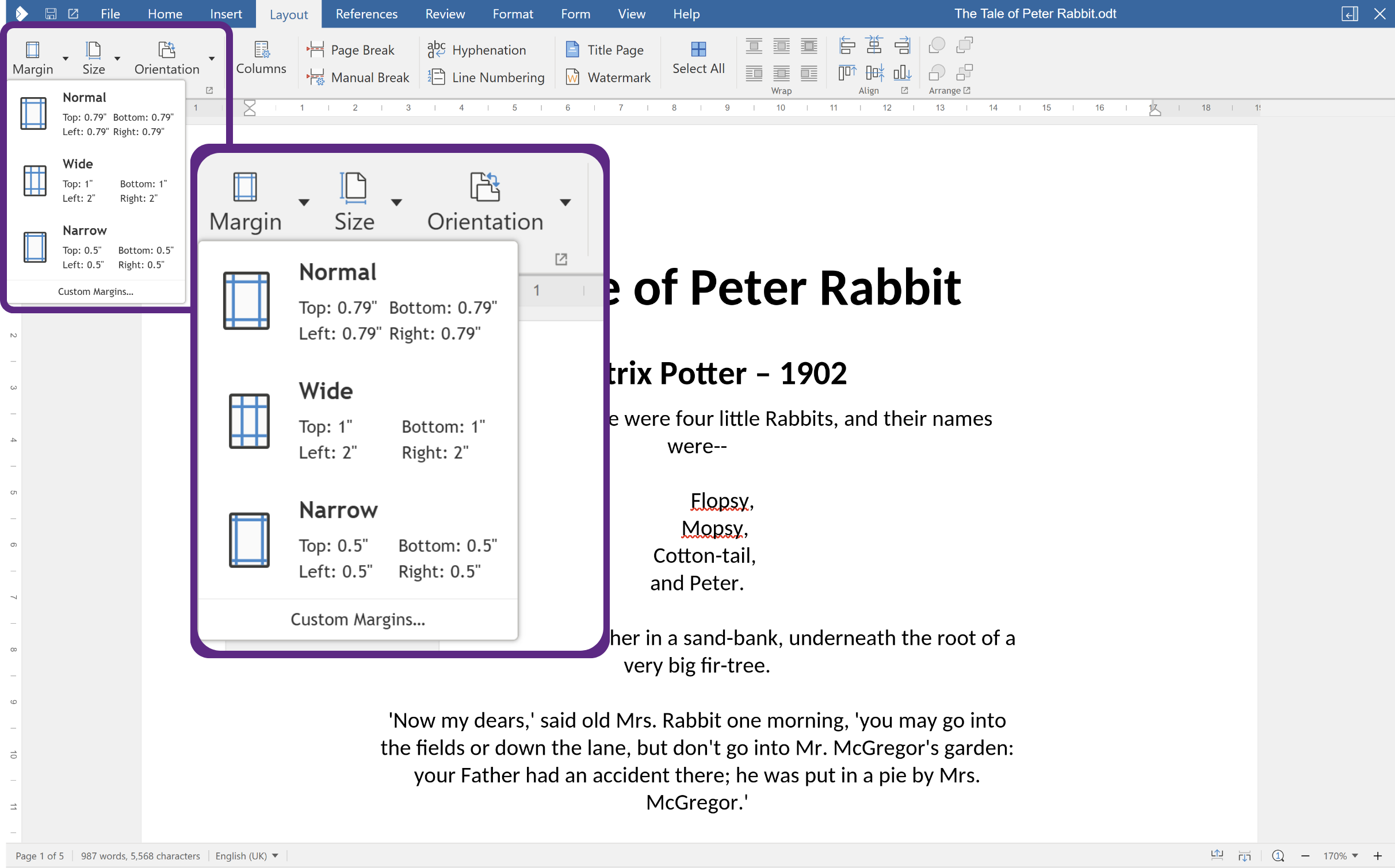
Truly responsive layout: goodbye horizontal scrollbars
Whether you’re on a narrow split‑screen or a big external monitor, the interface reflows intelligently. As the window narrows, related controls group together and are accessible via compact dropdowns, rather than forcing horizontal scrolling. It’s the same power, just right‑sized for your screen.
We’ve also made the Character and Paragraph formatting dialogs easier to reach directly from the toolbar – great if you like things at the top, and prefer not to open the sidebar.
The visual grouping of functions into categories such as ‘Clipboard’, ‘Font’, ‘Paragraph’ and others also helps users identify related functions, and intuitively learn new or more advanced features.
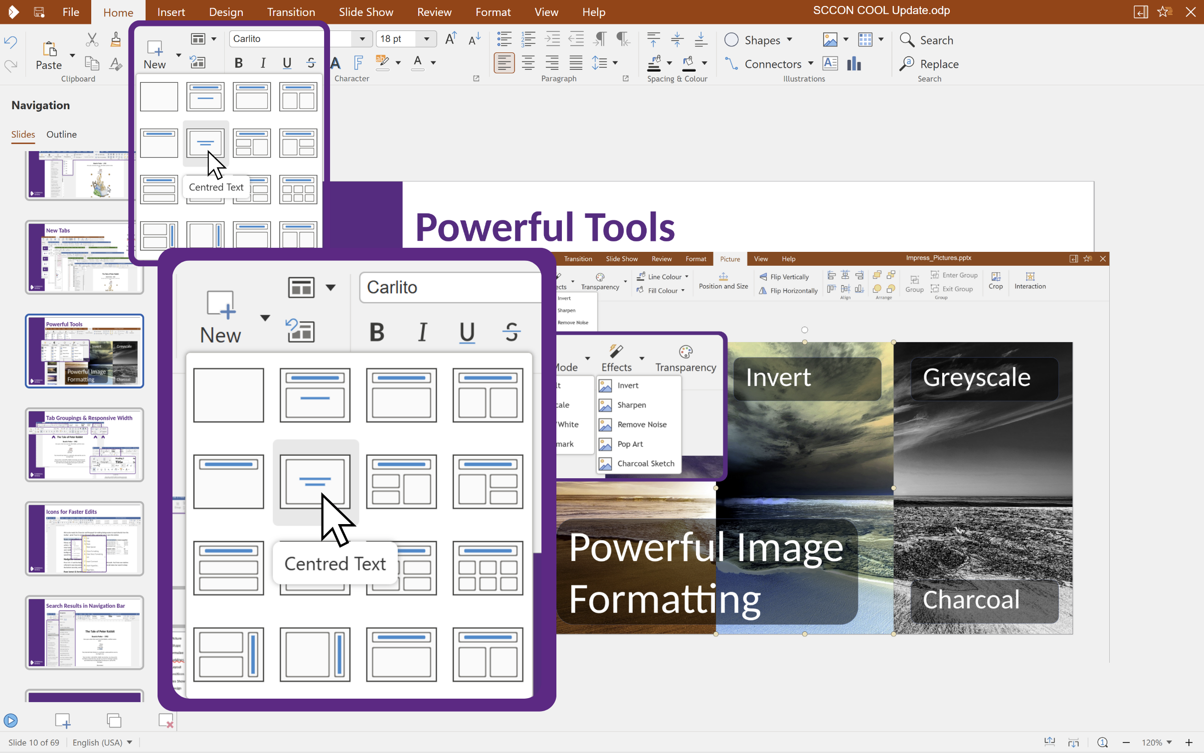
Icons everywhere for instant recognition
Menus and context menus now include clear icons alongside actions – from Copy and Paste to Insert sheet, Insert or Delete rows/columns. Visual cues reduce hesitation and help newer users build muscle memory quickly. Additionally our hover tooltips now all display keyboard shortcuts where available to speed things up in the future.
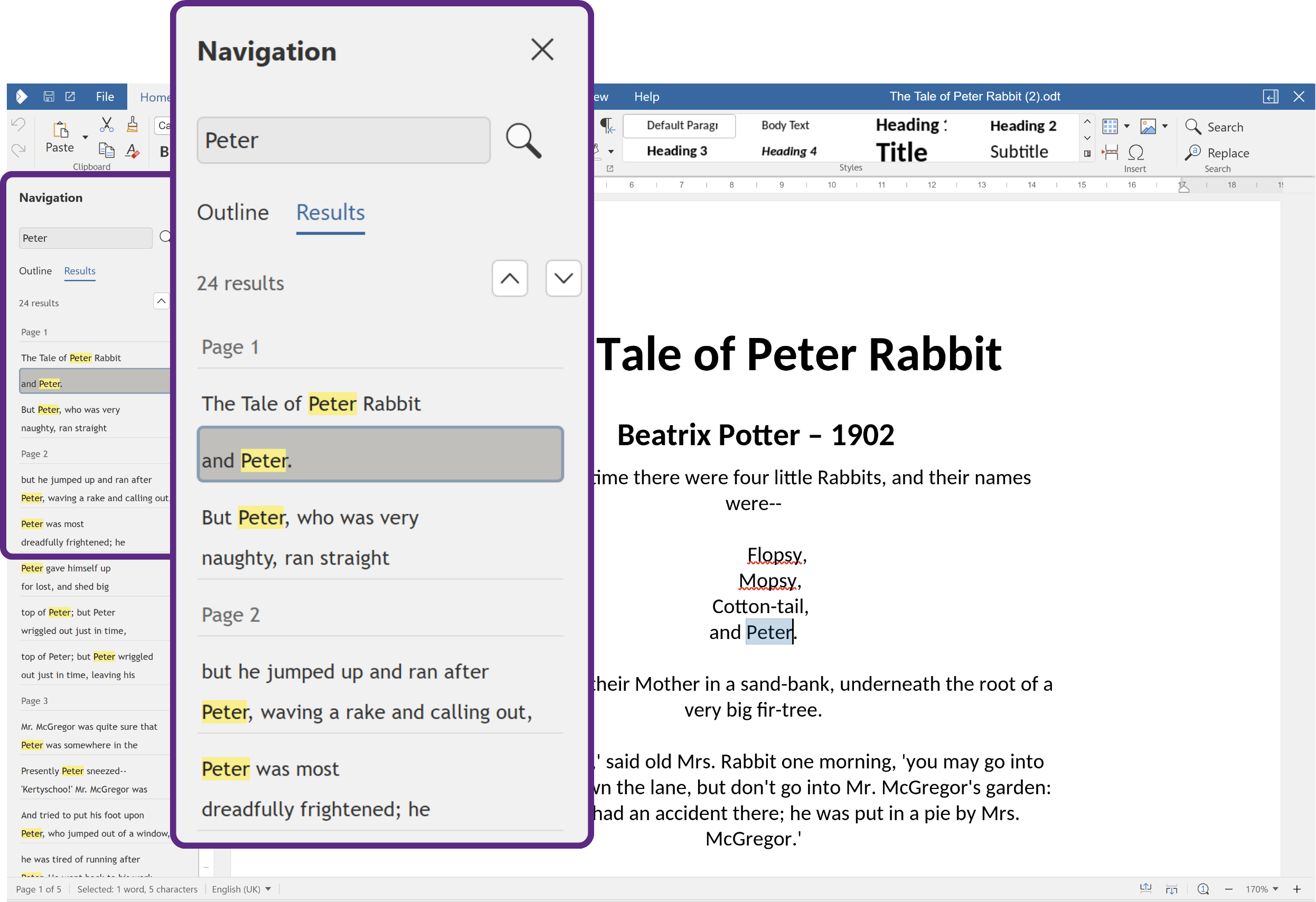
Navigation sidebar: find more, faster
Press Ctrl + F and the Navigation panel opens at the side, listing all results. You’ll also see matches reflected in your document outline (headings). We’ve removed the old status‑bar search to keep the bottom toolbar tidy, and Find & Replace is now the default flow.
Quality‑of‑life touches
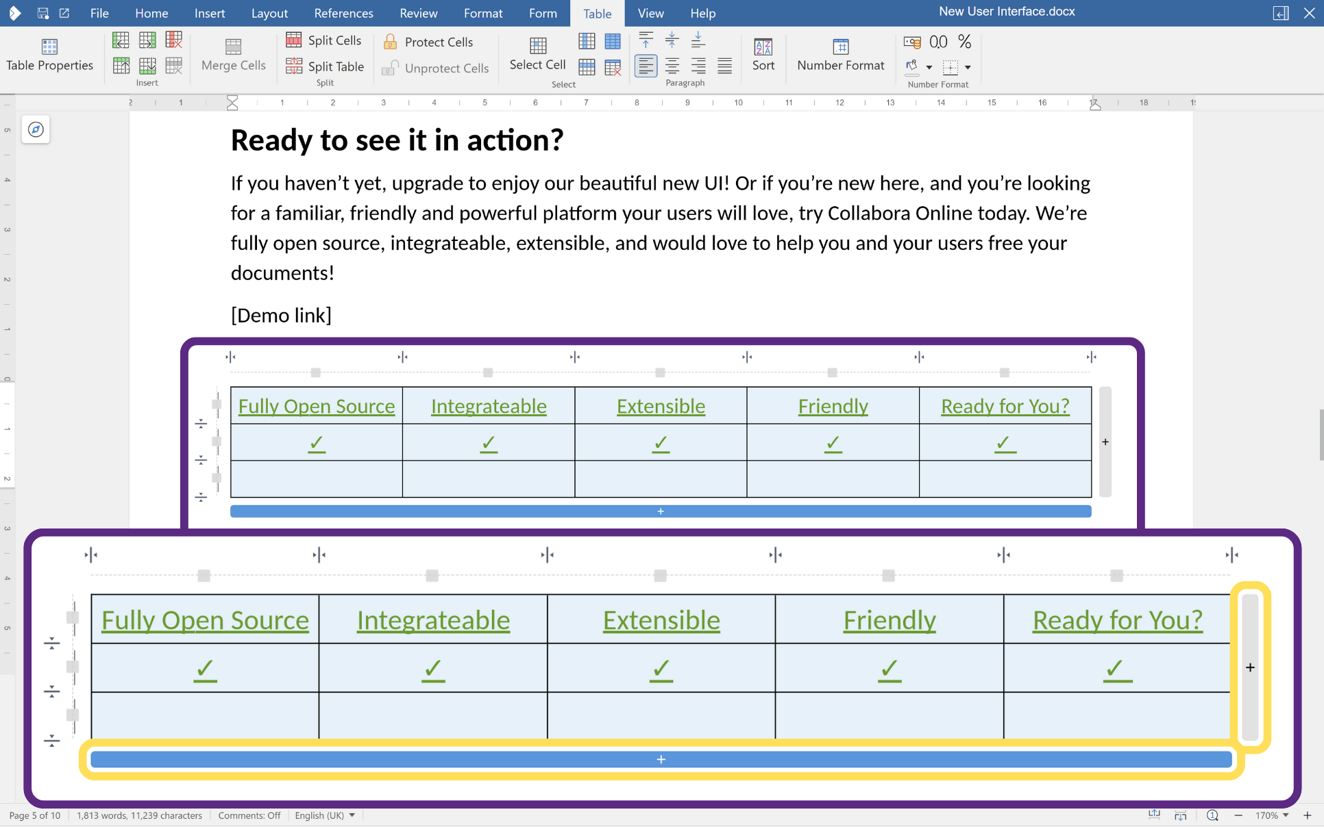
- Add rows in tables from the sides or bottom – right click + insert still works, as does the new table tab, but why not make things easier?!
- You’ll also notice subtle highlighting and cursor changes that reflect the active tab, so it’s obvious what mode you’re in.
- More native cursors are on our shortlist of things to do – watch this space!
Ready to see it in action?
Round 3 of changes is on the way soon, or you can check out round 1 here, but we hope this gives you a taster of some of the hard work that’s already in Collabora Online!
If you haven’t yet, upgrade to enjoy our beautiful new UI! Or if you’re new here, and you’re looking for a familiar, friendly and powerful platform your users will love, try Collabora Online today. We’re fully open source, integrate-able, extensible, and would love to help you and your users free your documents!
